Your order to deliciousness is here ! Happy ordering 🍕
ABOUT
As Jubilant Foodworks expand in multiple new cities (considerably tier 2 and tier 3 cities). It becomes important to understand the consumer mindset in accordance with food habits and ordering trends.
ROLE
Product Designer
As part of Domino’s Design Team, I focused on curating localised experiences for different demographics by understanding regional consumer behavior and ordering patterns.
PLATFORM
Mobile Application
DURATION
20 Weeks
SCOPE
WHAT?
Localization focuses on curating digital experiences that can cater to
different communities by reflecting the local languages and culture.
Tier 2 and tier 3
Cities in India are classified into tiers 1, 2, 3 and 4 by the Government considering various factors including population.
Difference ?
22 official languages
Multiple income group
7 Major regions
Traditional cuisines
Aim?
Understanding Food trends in different Cities.
Influencing next billion
Making ordering easy
CHALLENGE
Design tasks and challenges
To understand the mindset of the local population, it became important to penetrate deep into these territories and directly talk to the consumers.
Introducing new concepts that can benefit the consumer as well as the business.
Improve the human-application interaction by implementing new concepts and capabilities.
RESEARCH
How do we know what
consumers need?
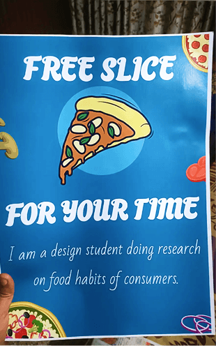
To understand the mindset of the local population, it became important to penetrate deep into these territories and directly talk to the consumers. For this, some innovative research techniques had to be applied as it might not be possible to reach all the target audience via telephonic or online interviews.

Meathods
Online/ Telephonic Interviews
Intercept studies
Incentive based research
Comprehensive studies (store visits and application studies)

Orders ?
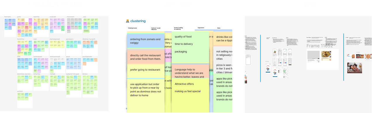
“ I generally order using swiggy or zomato”
“I just go to near-by shop and eat.”
“I look for healthy options even consuming fast food.”
Fast Food
“ I eat samosa chai”
“With family, I eat north Indian with friends I eat pizza and burgers.”
I look for some thing fast and easy, certainly pizza’s”

Influence
NO, I order what I want to
“Yes, sometimes I do get influenced by people around me.”
“I do ask friends for food suggestions”
INSIGHT
It was localized inclusivity
The project took an interesting turn when I was able to find different consumer groups emerging up,
based on their level of understanding language and their ordering trends in the same region.

PERSONA
Understanding the user, solving their problems
In order to consolidate the different aspects of different users, I created persona
Mohammad
Next billion • Cab driver • Gurgaon
🅰️ Not proficient in English
🏢 Travel between urban and semi urban areas
👁 Orders what they already know
📱Limited understanding
🍕 Need to be educated about fast food
🫂 order with groups
Importance?
They form the largest group of consumers (based on work). This is still an untapped market for most QSR.
450 M
people have blue collar jobs
Challenges?
Orders are based on suggestions from friends, Colleagues and room mates
Visual cues like product images preferred over Descriptions
Use a mixture of regional language and english
IDEATION
⚡️ Brainstorming ⚡️
Sorting things lead to HMW and I resolved it by a competition
New Innovations
Fresh solutions for the untapped market
I designed multiple freatures to make the app more interactive
An audio note system to support multiple local languages

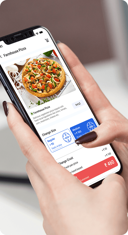
Helping users to narrow down the options causing less confusion and irritation

Helping users to narrow down the options causing less confusion and irritation

PRINCIPLES
Design principles
We defined design principles that will be followed through out
the feature and application design
Images to be preferred over text for information delivery.
Important decision making information should be available upfront to the user
The number of clicks from seeing the product to ordering it should be minimum
SOLUTION
Where do we start?
I started with working on the card design since it forms the base of every section
"The information is overwhelming. This is confusing and it is difficult to understand what is going on.
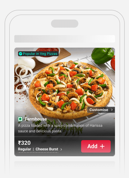
Instead of helping consumers, the product card was instead causing confusion.
After investigating it was found that the cards do not fit the natural reading patterns.


SECTION DESIGNS
Turning Data and social
influence into design


Locally famoous
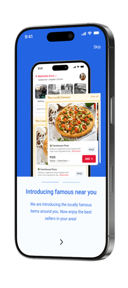
As it was found that users do get influenced by their social circles. Thus introducing a locally famous section to make selection process easy
Visually driven
The new design is visually driven making images hero. Large images and icons have been used to help the user understand the item and navigate fluently


Other features
Video launches - Videos can be a great source to educate consumers about new products inducing emotions and telling story of the product.
Emotional cues - Been to a party with a lot of booze and pizza? ever celebrated birthday at dominos? Introducing banners to bring back to subconscious memories
Breadcrumbs - Adding tabs in the end of the page in case the user has still not found out what they are looking for.
LANGUAGE FEATURE DESIGN
Addressing the language dilemma
India has 22 official languages. But most applications provide at most options to convert English into Hindi. I took this as a challenge to find other ways to solve this puzzle
Converting it? No?
Users use multiple apps during the day with English as primary language, hence they understand words and phrases. Reading text in other language can be pain as compared to boon.
Then what?
On the other hand audios are easier to understand as compared to texts. They can be implemented wherever required in the app (eg. product card)

When we do not understand something in a restaurant, we seek help from the waiters. Then why can’t
we have a host on digital platforms?

OTHER SCREENS
Design for everyone
closing feedback loops
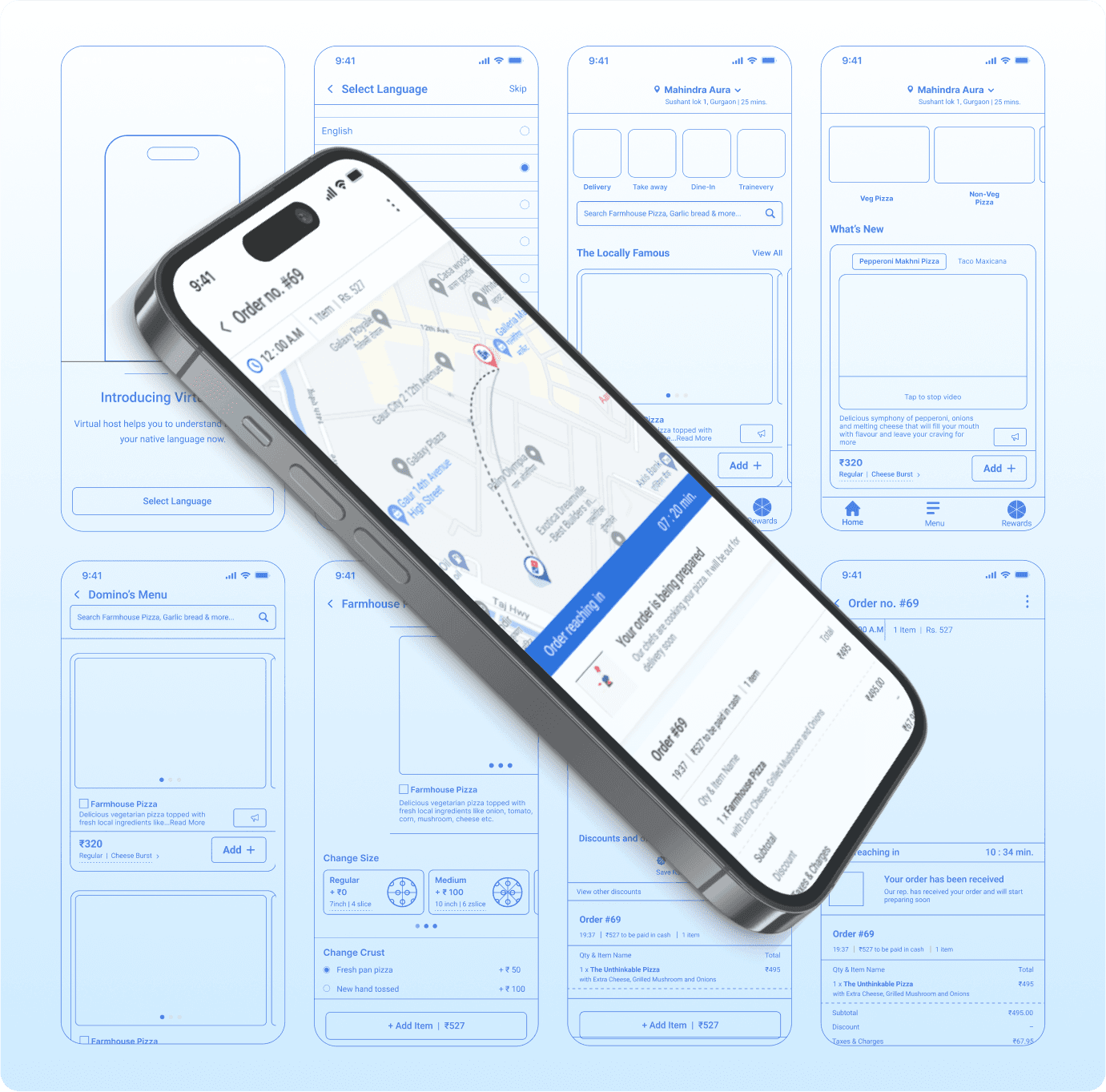
I tackled every screen , edge case and feedback loops

WHAT'S NEXT
Near-by drop off
though Domino’s does not deliver in consumer areas, users still order products to near by places and pick up from there. This gives an opportunity to design a service through which everyone can benefit.
Possible ?
Domino’s is Introducing Pinpoint Delivery that allows customers to receive a delivery nearly anywhere, including places like parks, baseball fields and beaches in USA
With Domino’s Pinpoint Delivery, customers can receive their order at a countless number of dynamically created hyper-local spots without a typical address.


Working?
This is a real scenario for some users who live in no delivery zones but want to reach out to the brand.

Benefits
Providing near by points can increase brand reachability for the consumer who reside in non deliverable areas.